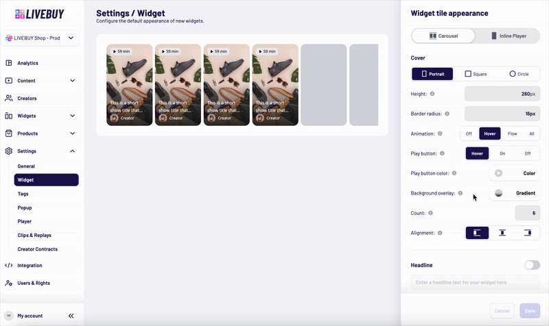
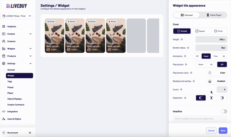
The Carousel widget displays multiple content tiles in a horizontal scrollable layout. You can customize the following elements:
Cover Settings
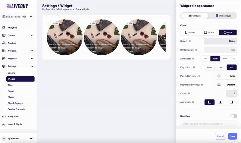
Cover Shape
Choose the cover shape:
-
Portrait
-
Square
-
Circle
Cover Size and Style
-
Set the height of the covers in pixels
-
Only positive integer values are allowed
-
-
Set the border radius using valid CSS values to match your shop’s design and CI
Preview Animation
Control how preview animations are displayed on the covers:
-
Off – No cover animations
-
Hover – Animation plays when the user hovers over a cover
-
Flow – Covers animate one after another automatically - the animated cover switches after 5 seconds
-
All – All covers animate simultaneously
Play Button Behavior
Choose how the play button is displayed on the covers:
-
Off – Play button is hidden
-
Hover – Play button appears on hover
-
On – Play button is always visible
-
Set the play button color using the color picker
-
Adjust the transparency of the play button by the color picker
Background Overlay
Use the color picker to configure the overlay that sits above the cover image and beneath UI elements (such as badges and titles) to ensure sufficient contrast.
Count
-
Define the maximum number of covers visible at once (depending on device size)
Alignment
-
Set the alignment of the widget inside the page it’s implemented.
Headline
-
Disabled by default
-
Enable via toggle to add a headline text above the widget
-
Customize:
-
Font family
-
Font size
-
Font weight and style
-
Text color
-
Alignment inside the widget
-
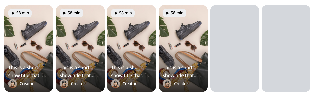
Content Title
-
Shown in the lower part of each widget tile
-
Displays the title of the content piece
-
Can be disabled completely
If enabled, you can configure:
-
Font family
-
Font size
-
Font weight and style
-
Text color
-
Alignment inside the widget

Badge
-
Displayed at the top of the widget tile
-
Shows:
-
The length of the content, or
-
“Live” if a live show is currently running
-
-
Can be fully disabled
Customization options:
-
Text styling (font family, size, weight, style, color)
-
Text alignment
-
Background color by color picker
-
Background transparency
-
Border radius
-
Outline color by color picker
-
Outline width (valid CSS value)
Creator Avatar
-
Displayed below the content title at the bottom of the widget tile
-
Shows the creator’s profile picture
-
Can be disabled
If enabled, you can configure:
-
Size using a valid CSS length unit (e.g. px, rem) or a percentage (%)
-
Percentage values are relative to the cover height
-
-
Fixed 1:1 aspect ratio
-
Border radius (valid CSS)
-
Outline color and outline width
-
Alignment inside the widget
Creator Name
-
Displays the creator’s nickname
-
Shown next to the avatar below the content title
-
Can be disabled
If enabled, you can customize:
-
Font family
-
Font size
-
Font weight and style
-
Text color
-
Alignment inside the widget

Preview and Saving Changes
-
Use the Preview to see how your changes affect the widget in real time
-
Always save your changes before leaving the page to avoid losing adjustments
If you need help designing widgets or choosing the best configuration for your shop, please contact support@livebuy.io.