In the Style tab, you can configure the widget type and customize the appearance of your widget. The initial configuration for new widgets is based on your widget settings but can be adjusted for individual widgets.
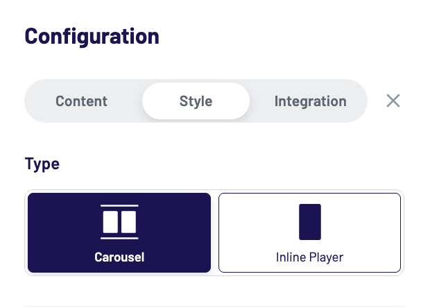
Widget Type
Select either the Carousel or Inline widget type to continue with the style configuration.
Carousel widgets display multiple content tiles in a horizontally scrollable layout. They are ideal for showcasing a variety of clips or shows at once and allow users to browse through different content pieces before choosing what to watch.
Inline Player widgets, on the other hand, display a single video player directly within the page layout. The content plays inline and creates a social-media-like experience similar to TikTok, Instagram Reels, or YouTube Shorts. Viewers can scroll vertically through videos, making this widget type ideal for immersive, snackable content consumption.
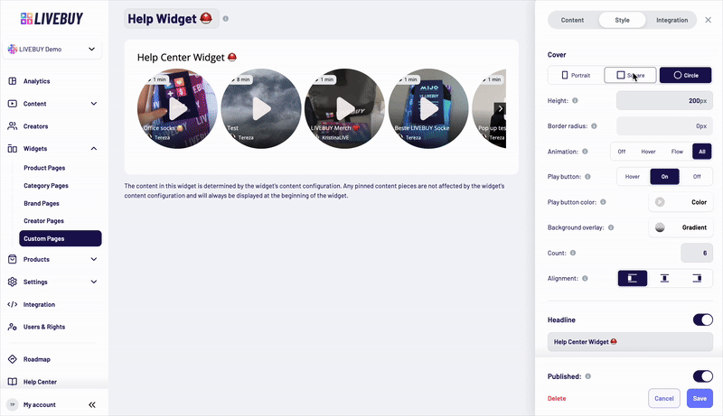
Cover Settings for Carousel Widgets
Cover Shape
Choose the cover shape:
-
Portrait
-
Square
-
Circle
Cover Size and Style
-
Set the height of the covers in pixels
-
Only positive integer values are allowed
-
-
Set the border radius using valid CSS values to match your shop’s design and CI
Preview Animation
Control how preview animations are displayed on the covers:
-
Off – No cover animations
-
Hover – Animation plays when the user hovers over a cover
-
Flow – Covers animate one after another automatically - the animated cover switches after 5 seconds
-
All – All covers animate simultaneously
Play Button Behavior
Choose how the play button is displayed on the covers:
-
Off – Play button is hidden
-
Hover – Play button appears on hover
-
On – Play button is always visible
-
Set the play button color using the color picker
-
Adjust the transparency of the play button by the color picker
Background Overlay
Use the color picker to configure the overlay that sits above the cover image and beneath UI elements (such as badges and titles) to ensure sufficient contrast.
Count
-
Define the maximum number of covers visible at once (depending on device size)
Alignment
-
Set the alignment of the widget inside the page it’s implemented.
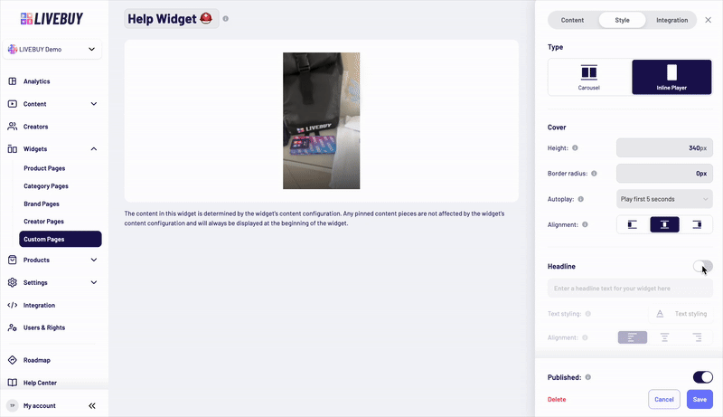
Cover Settings for Inline Player Widgets
-
Set the height of the cover in pixels
-
Only positive integer values are allowed
-
-
Set the border radius using valid CSS
-
Set the alignment of the element inside the widget
Autoplay Behavior
Configure how videos autoplay in the Inline Player widget. Autoplay is always muted and only starts when the video becomes visible to the user.
Available options:
-
No autoplay – User must click to start the video
-
Play first 5 seconds
-
The first 5 seconds of the video are played automatically. If the video is shorter than 5 seconds, it loops until a total of 5 seconds is played and then stops.
-
-
Play first 10 seconds
-
The first 10 seconds of the video are played automatically. If the video is shorter than 10 seconds, it loops until a total of 10 seconds is played and then stops.
-
-
Play full video 1 time – Plays once from start to end
-
Play full video 2 times – Plays twice from start to end
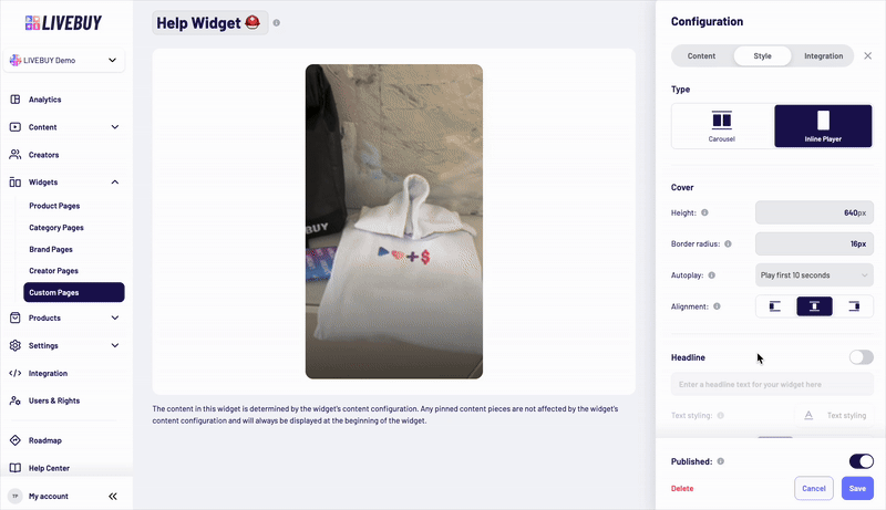
Headline for Carousel & Inline Player Widgets
-
Disabled by default
-
Enable via toggle to add a headline text above the widget
-
Customize:
-
Font family
-
Font size
-
Font weight and style
-
Text color
-
Alignment inside the widget
-

Content Title (Carousel only)
-
Shown in the lower part of each widget tile
-
Displays the title of the content piece
-
Can be disabled completely
If enabled, you can configure:
-
Font family
-
Font size
-
Font weight and style
-
Text color
-
Alignment inside the widget
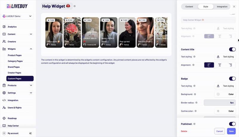
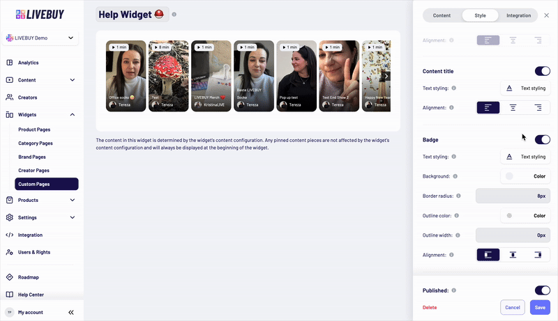
Badge (Carousel only)
-
Displayed at the top of the widget tile
-
Shows:
-
The length of the content, or
-
“Live” if a live show is currently running
-
-
Can be fully disabled
Customization options:
-
Text styling (font family, size, weight, style, color)
-
Text alignment
-
Background color by color picker
-
Background transparency
-
Border radius
-
Outline color by color picker
-
Outline width (valid CSS value)
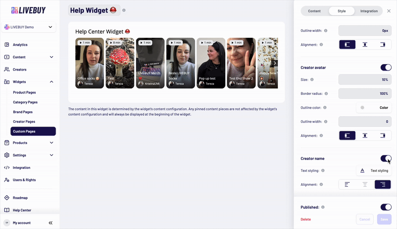
Creator Avatar (Carousel only)
-
Displayed below the content title at the bottom of the widget tile
-
Shows the creator’s profile picture
-
Can be disabled
If enabled, you can configure:
-
Size using a valid CSS length unit (e.g. px, rem) or a percentage (%)
-
Percentage values are relative to the cover height
-
-
Fixed 1:1 aspect ratio
-
Border radius (valid CSS)
-
Outline color and outline width
-
Alignment inside the widget
Creator Name (Carousel only)
-
Displays the creator’s nickname
-
Shown next to the avatar below the content title
-
Can be disabled
If enabled, you can customize:
-
Font family
-
Font size
-
Font weight and style
-
Text color
-
Alignment inside the widget
Preview and Saving Changes
-
Use the Preview to see how your changes affect the widget in real time
-
Only when content is already added to the widget you can see content in the preview
-
-
Always save your changes before leaving the page to avoid losing adjustments
If you need help designing widgets or choosing the best configuration for your shop, please contact your Key Account Manager or our support team.